Color Palettes We’re Loving This Year
Modern meets masala—from earthy tones to regal richness, these combos are everything.
Color is more than decor in an Indian wedding — it’s emotion, tradition, personality, and a whole vibe. And in 2025, couples are trading over-the-top saturation for intentional, inspired color palettes that reflect who they are.
Whether you’re planning a palatial affair in Jaipur or a minimalist fusion wedding in Toronto, here are the top wedding color palettes we’re loving this year, and what they say about your style.

Ivory + Gold (Always Iconic)
Vibe: Regal. Pure. Understated opulence.
Perfect for: Temple weddings, luxe banquet halls, minimalist invites.
Pair it with: Emerald, blush, or maroon for contrast
Why we love it: It works across cultures, day/night events, and feels timelessly South Asian.
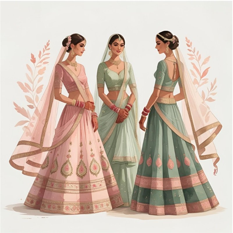
Blush + Sage + Dusty Rose
Vibe: Romantic garden wedding meets mehendi magic
Perfect for: Outdoor ceremonies, floral mandaps, pastel lehengas
Pair it with: Matte gold or champagne accents
Why we love it: It’s soft, feminine, and photograph-ready in any light.
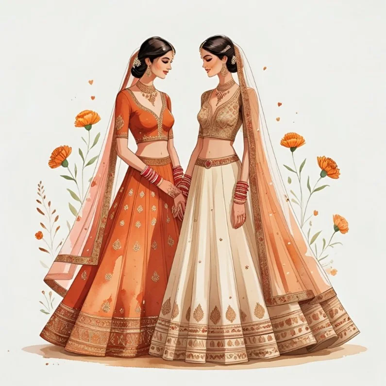
Terracotta + Marigold + Sand
Vibe: Boho desi, earthy, joyful
Perfect for: Haldi, sangeet, or beachside celebrations
Pair it with: Brass tableware or wild florals
Why we love it: A nod to haldi and Indian spices—warmth with a modern glow.

4. Emerald + Ivory + Antique Gold
Vibe: Bold elegance meets old-world glamour
Perfect for: Royal venue weddings, nighttime receptions
Pair it with: Velvet textures, regal fonts, and gold foil stationery
Why we love it: Sophisticated yet vibrant, especially in South Indian or Mughal-style themes.
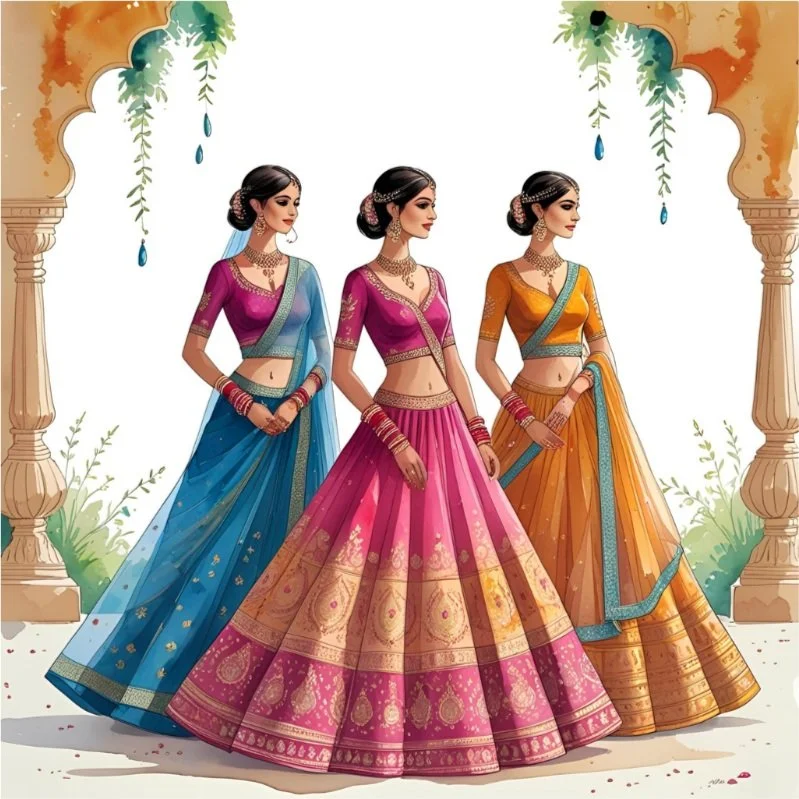
Fuchsia + Turmeric + Peacock Blue
Vibe: Festival meets fashion week
Perfect for: Sangeet, baraat, pre-wedding shoots
Pair it with: Mirrorwork, tassels, or neon signage
Why we love it: It celebrates color the Indian way—unapologetically bright and joyful.

Ocean + Sage + Dull Gold
Vibe: Fusion. Moody. Modern heirloom.
Perfect for: Reception decor, evening invites, winter weddings
Pair it with: Acrylic menus, wax seals, matte stationery
Why we love it: Deep tones + neutrals = serious style.

Lavender + Pistachio + Silver Foil
Vibe: Dreamy. Trend-forward. Playful and pretty.
Perfect for: Mehendi, bridesmaid outfits, welcome brunch
Pair it with: Soft floral illustrations and monogrammed signage
Why we love it: A subtle nod to Indian sweets—and very 2025 Pinterest board energy.
“Whether you go soft or bold, pastel or peacock, choose colors that feel true to you—and let them tell your story.”
Tips for Using Color Thoughtfully
Let one color lead, and others support—don’t overmix
Reflect regional symbolism or personal meaning (e.g., maroon for Bengali weddings, green for Nikkahs)
Match your stationery, signage, outfits, and florals for full impact
Use metallics and textures (brass, velvet, foil) to elevate your palette
Always test colors under your actual event lighting!
Need help matching your invitation suite or wedding website to your color palette? We design fully custom wedding stationery, monograms, and digital experiences that blend tradition with modern design.
Explore more at AnanyaBelle.com